Screen Printing
Halftones & Gradients
Behind The Bottle
Labels don’t just tell you what’s inside a bottle — they set the mood before the cork is even pulled. One of the most powerful ways to create that mood is through halftones and gradients. These decoration techniques allow designers to play with light, depth, and movement in ways that feel both modern and timeless.
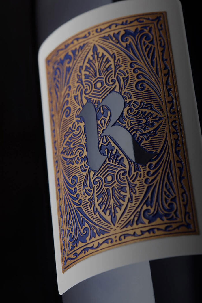
In screen printing, halftones and gradients aren’t just digital tricks — they’re physical layers of ink, carefully measured and placed. That precision transforms flat color fields into dynamic artwork, giving wine labels a dimensional quality that draws the eye and begs a closer look.
Services
- Screen Printing
What Halftones Bring to the Bottle
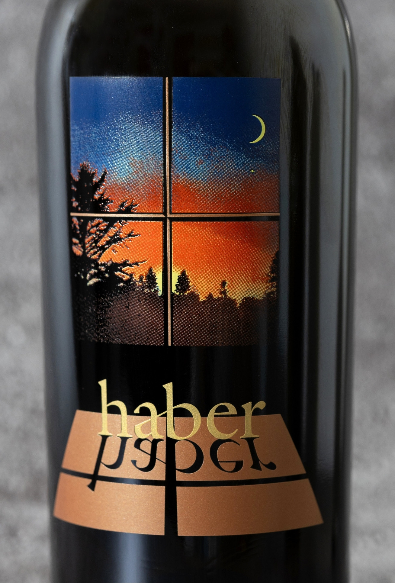
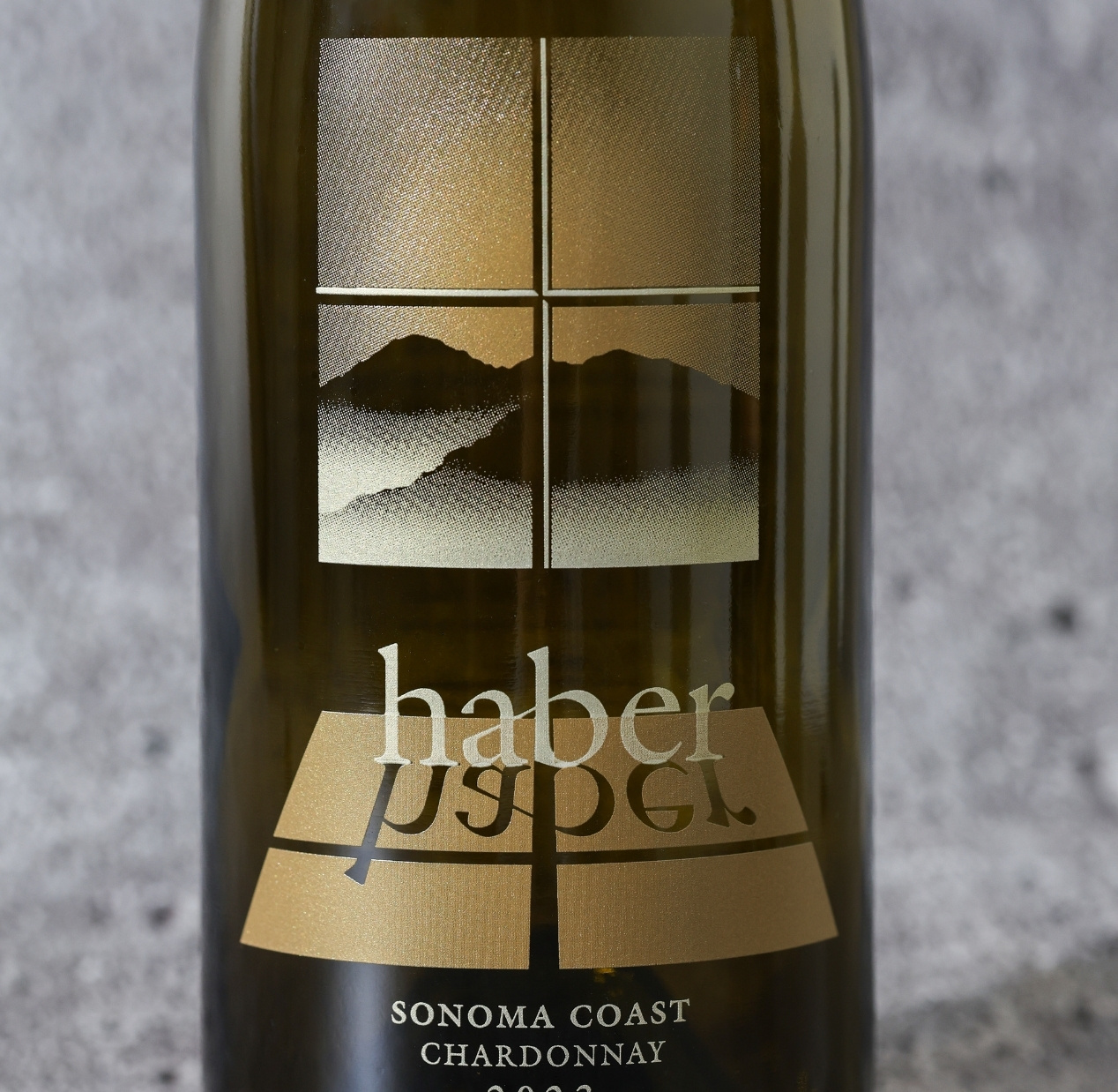
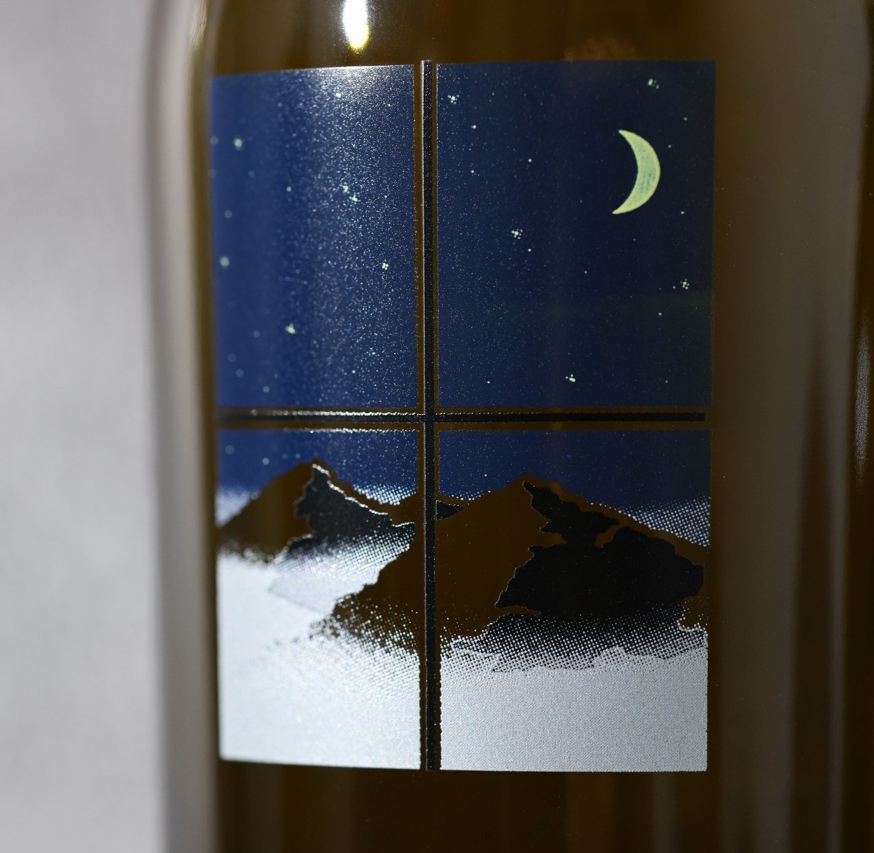
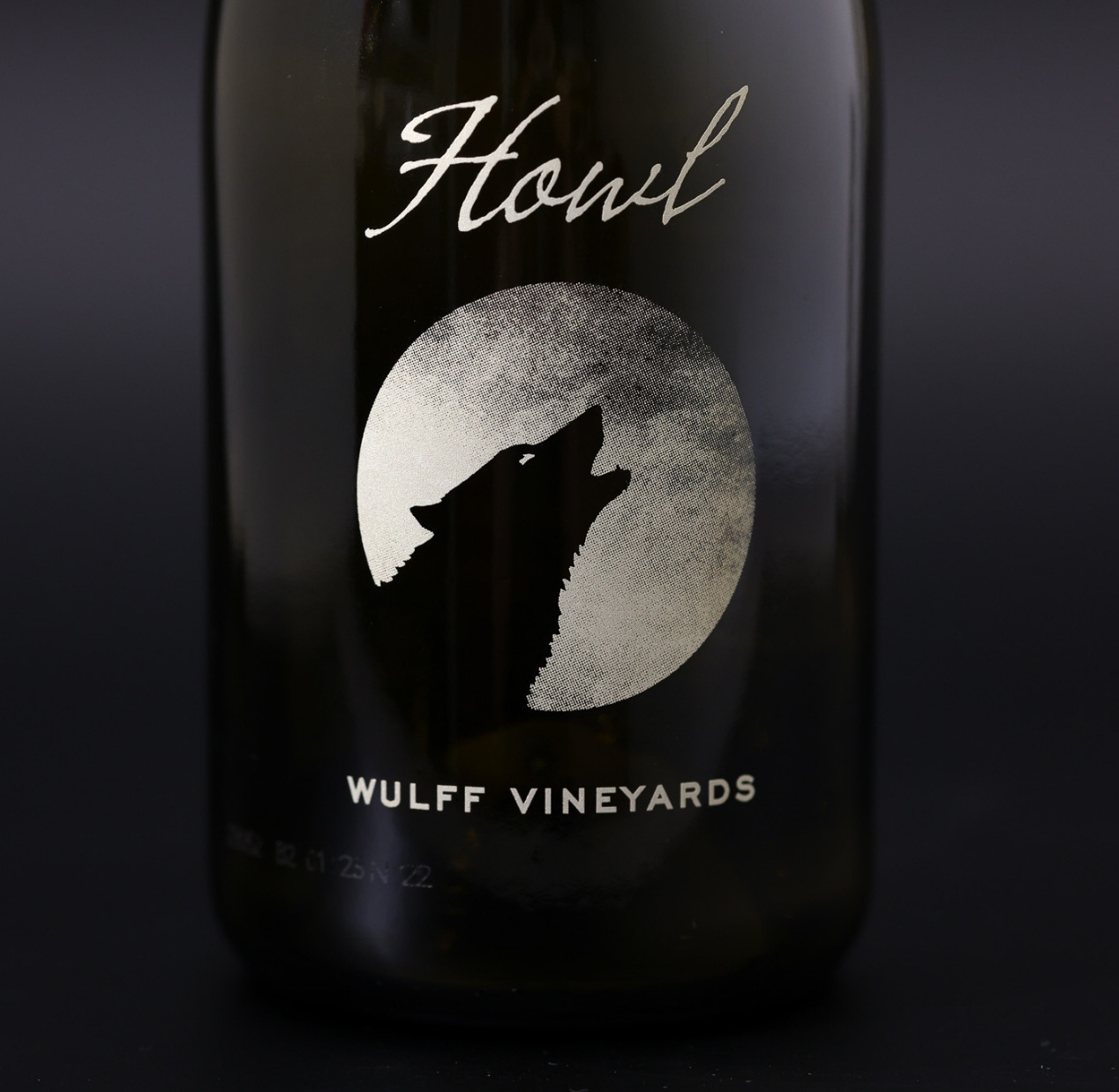
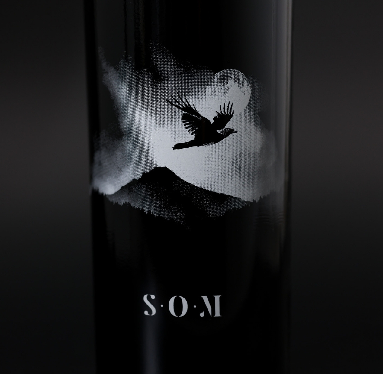
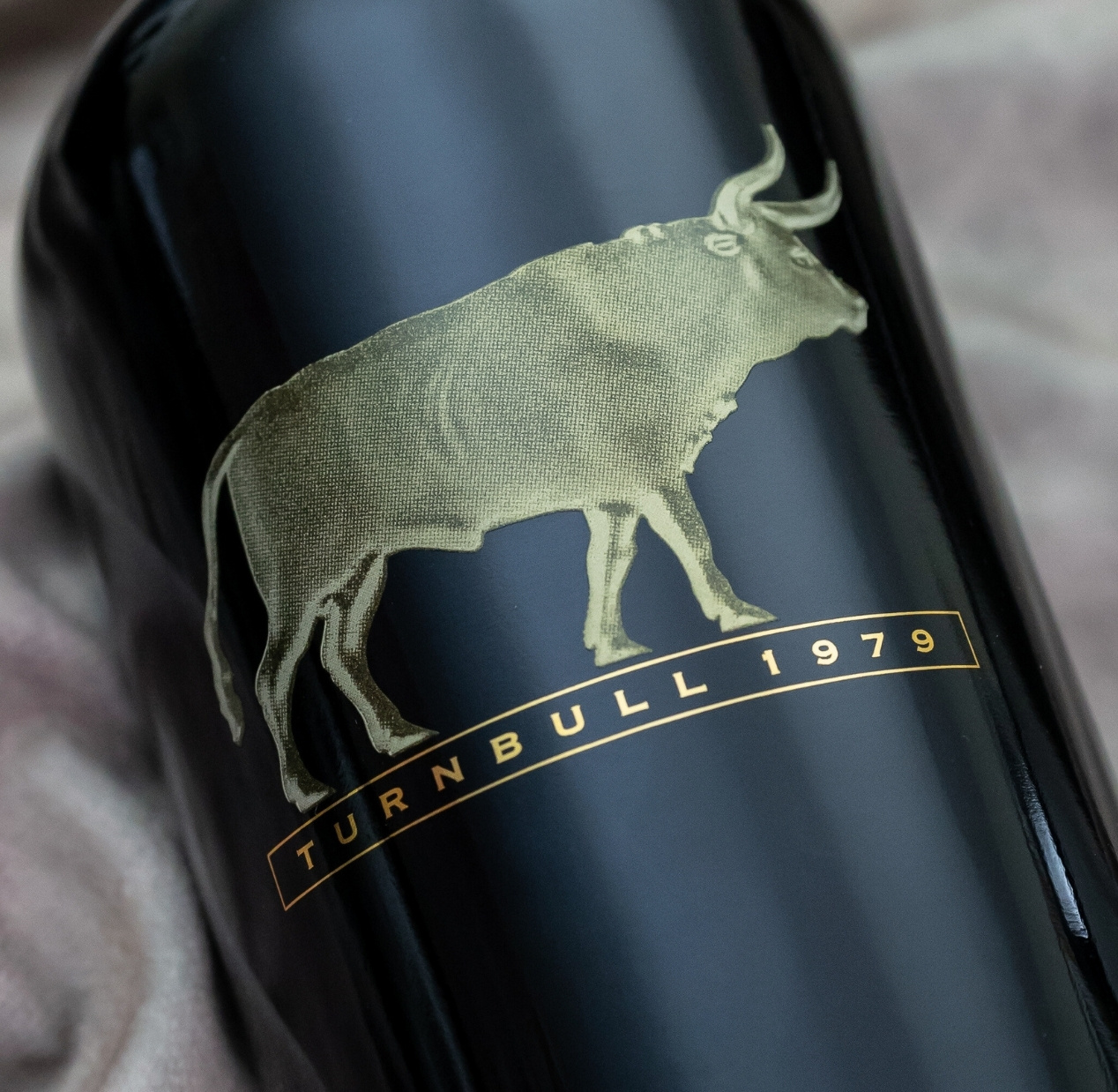
Halftones use a series of tiny dots to create shading, subtle transitions, and depth. On a wine label, they can add texture to illustrations, soften backgrounds, or blend colors without overwhelming the design. A halftone pattern can also help avoid visual distractions like moiré effects, ensuring the artwork stays crisp and clean on glass.
What makes halftones especially powerful in screen printing is their versatility. They can mimic the softness of watercolor washes, the grain of vintage photography, or the richness of hand-drawn etchings. By adjusting the scale of the dots, a design can shift from delicate tonal shifts to bold, graphic textures that stand out from across the room.
Halftones also add a tactile layer to the artwork. Because screen printing builds ink directly onto the glass, the dots have subtle dimension — giving the label a physical quality you can feel, not just see. This interplay of touch and sight helps reinforce the craft of the wine inside, creating a multisensory impression that stays with the consumer.
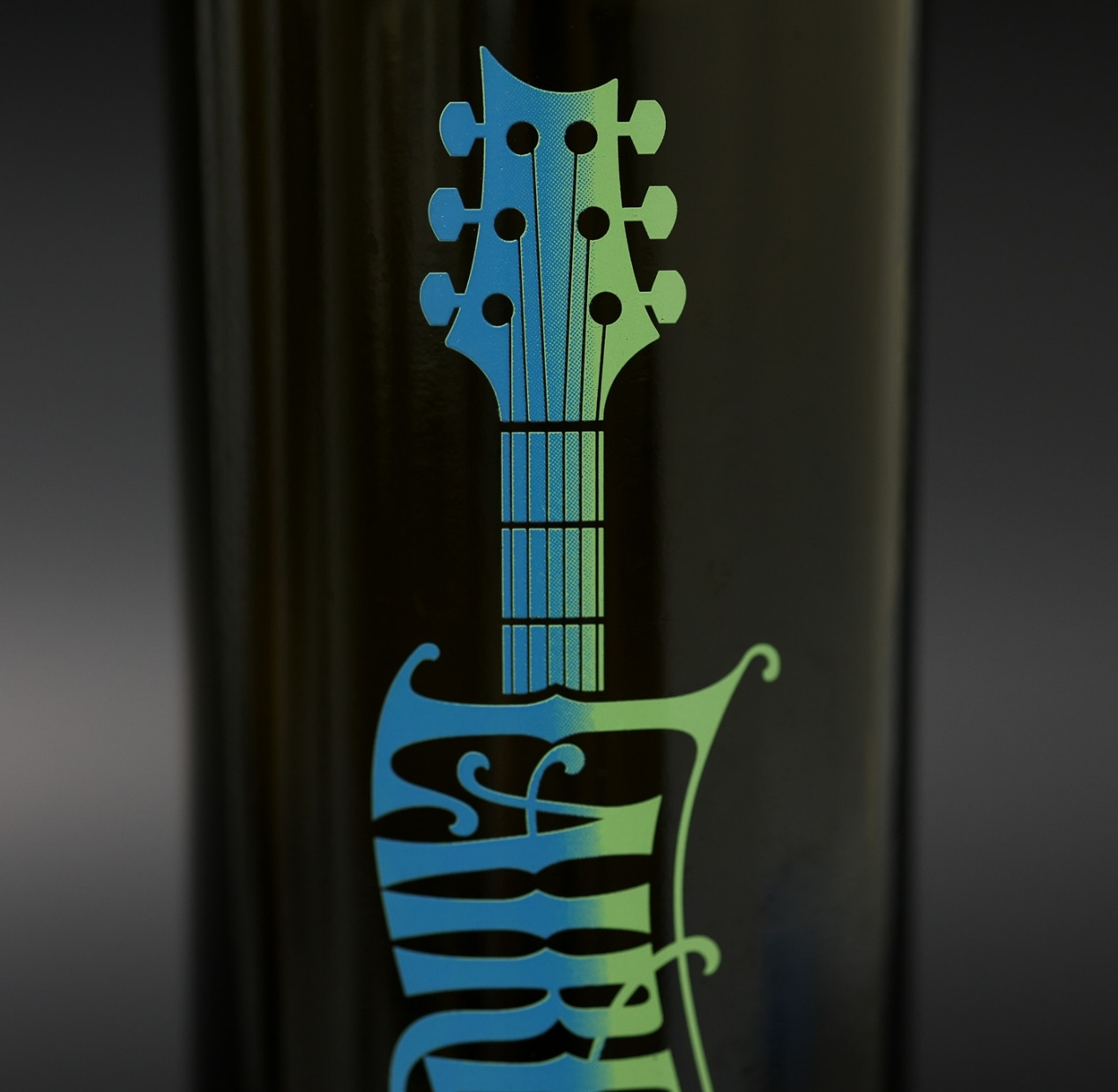
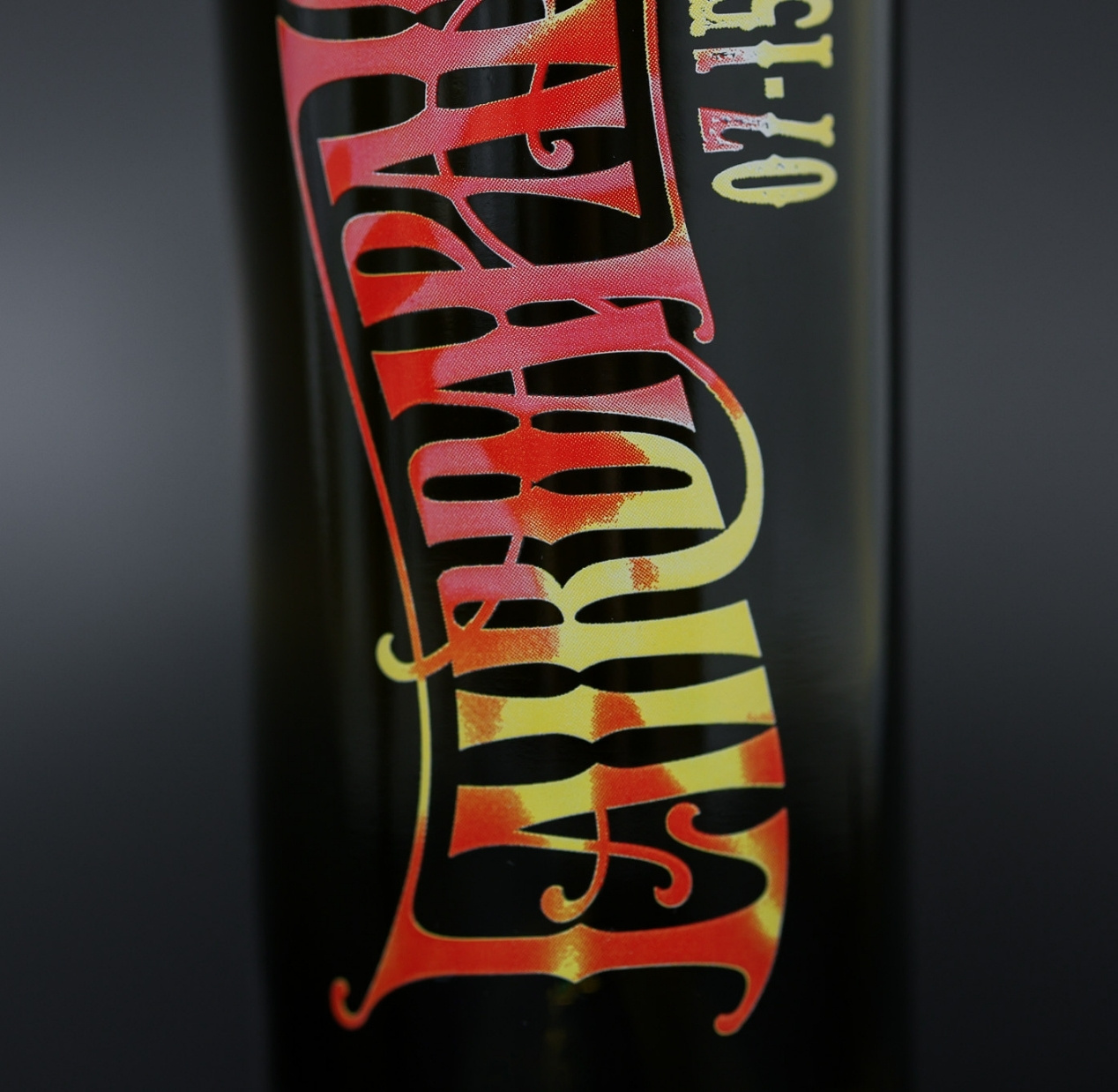
The Flow of Gradients
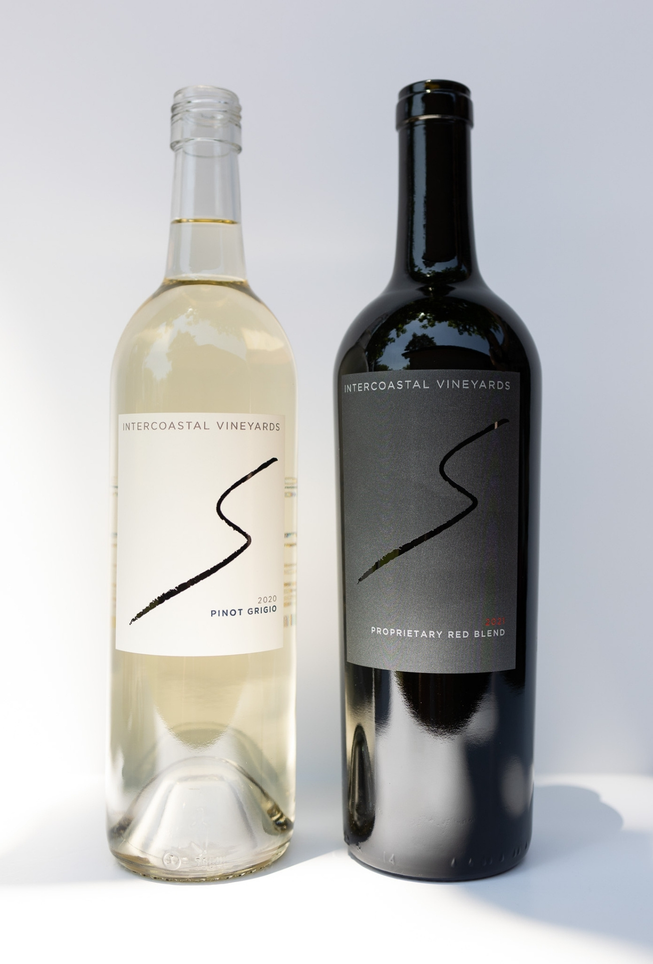
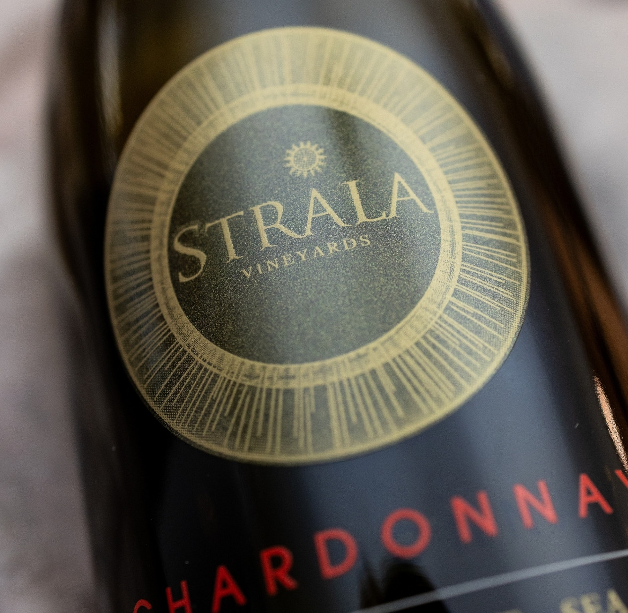
Gradients take a different approach — moving smoothly from one color or tone to another. With screen printing, these transitions can be bold and high-contrast or soft and delicate, depending on the inks used. They’re ideal for evoking natural inspiration — like the shift of color in a sunset, the pale blush of a rosé, or the rich depth of a red wine.
Because gradients can move in any direction — vertical, horizontal, radial, or even irregular fades — they open up endless design opportunities. A vertical gradient can elongate a bottle, making it appear taller and more elegant, while a circular fade can highlight a central logo or crest. Blended color fields can also suggest temperature, freshness, or flavor — a cooling blue-to-white fade for crisp whites, or a warm gold-to-amber wash for barrel-aged wines.

Why They Work in Screen Printing
Unlike pressure-sensitive paper labels, where halftones and gradients are purely printed graphics, screen printing gives them texture and life. Metallics can be worked into the fade, transparent inks can layer to create luminous effects, and flux can add a subtle glass-like shimmer. These details are only possible when the design is built up directly on the bottle itself.
A Modern Layer of Expression
Halftones and gradients open the door to creative expression that goes beyond flat ink. They give labels a sense of motion, dimension, and craft — qualities that elevate the entire experience of the wine label design. In the hands of a skilled designer and printer, even the simplest concept can take on extraordinary depth.