Beyond the Label: A Look at Bergin’s Screen Print Capabilities
Screen printing on glass is far more than a process. It’s a set of choices made in ink, layer by layer, that determine how a bottle presents itself in the world. Each technique opens a different visual and tactile possibility, and understanding those possibilities is where design decisions start to take shape.
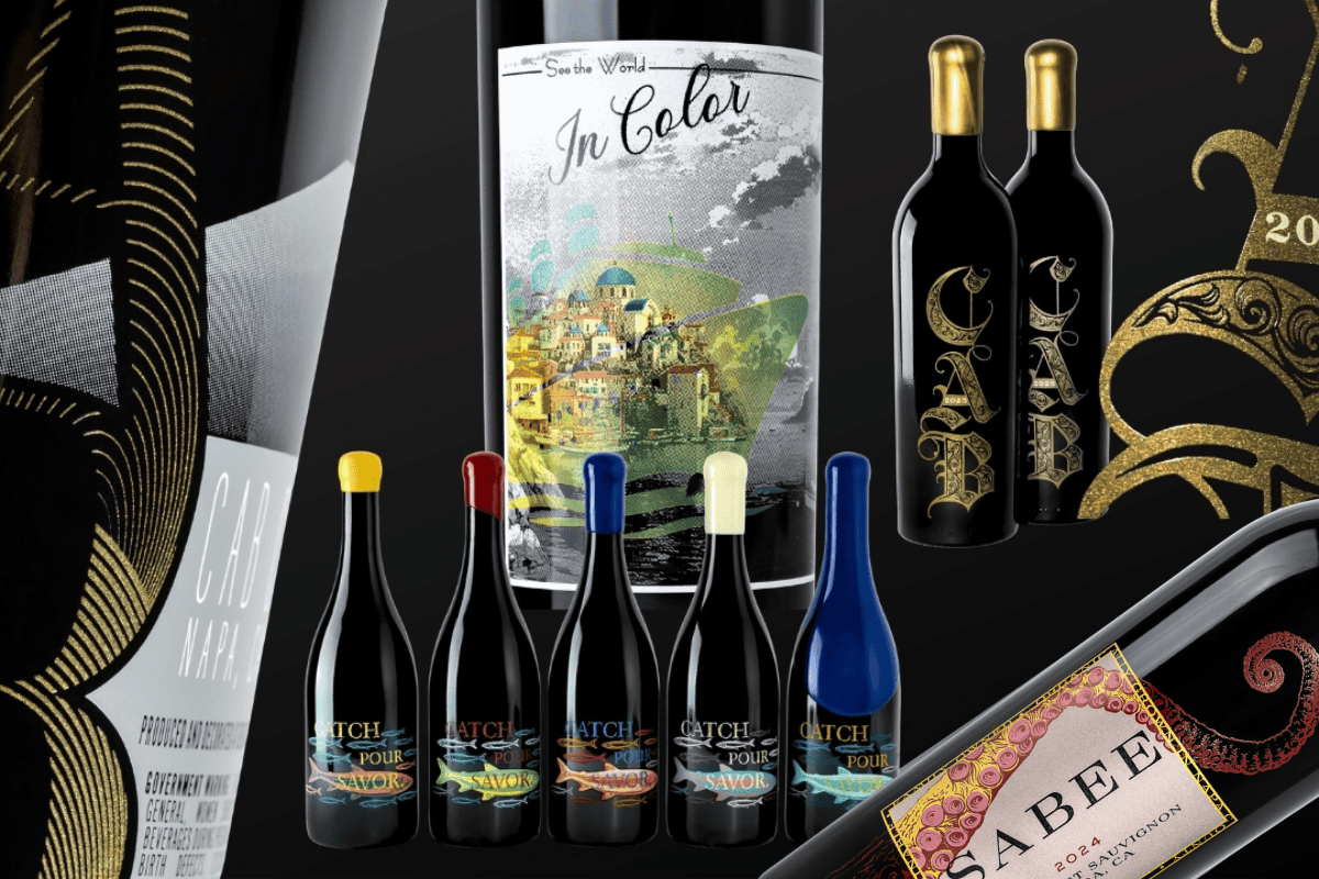
At Bergin, we’ve spent over 20 years refining our screen print capabilities in Napa Valley. The work spans bold multicolor designs, delicate tonal transitions, precious metal finishes, and full-bottle coverage, all applied directly to glass and cured permanently into the surface. This article walks through what those capabilities look like in practice, so you can approach your next project with a clearer picture of what’s possible.
Halftones and Gradients
Some of the most expressive work in screen printing happens at the level of the dot. Halftones and gradients use controlled patterns and color transitions to create depth, dimension, and movement on a flat glass surface, effects that go far beyond what solid ink fields can achieve on their own.

Halftones work through a grid of tiny dots that vary in scale to simulate shading and tonal range. On glass, this translates into texture you can see and feel, as the dots carry subtle physical dimensions as the ink builds up on the surface. A halftone can soften an illustration’s background, create a vintage photographic quality, or produce the kind of delicate gradation that reads as hand-drawn from a distance.
Gradients take a different approach, moving smoothly from one color or tone to another across the label surface. They can run vertically, horizontally, or radially, and they interact with the bottle’s curvature in ways that feel dynamic rather than printed. A well-executed gradient can elongate a bottle visually, evoke seasonal palettes, or give a label a sense of motion and life that flat color fields cannot.
Together, halftones and gradients are among the most technically demanding capabilities in screen printing and among the most effective at communicating craft.
Precious Metal Inks

Gold, platinum, and copper inks bring a distinct quality to a screen printed bottle: the sense that the decoration itself carries material value. Precious metal inks achieve this not through embossing or foiling, but through carefully formulated metallic pigments applied directly to the glass.
Each metal communicates something different. Gold carries warmth and heritage, suggesting depth of history and richness of product. Platinum reads as sleek and modern. Copper sits between the two, grounded and organic, with a warmth that pairs naturally with estate and vineyard focused brands.
What makes precious metals particularly effective in screen printing is how they respond to light and surface contrast. Because precious metal inks must be printed directly to the glass surface and cannot be layered over other inks, their placement requires intentional design planning. A gold, platinum, or copper accent creates contrast that draws the eye to specific design elements, whether a crest, a varietal name, or a border. Applied more broadly, they can shift the entire character of a label toward luxury. The decision of where and how much precious metal to use is part of the design consultation we bring to every project.
360° Wrap Design
Screen printing isn’t confined to the front and back label zone. A 360° wrap design treats the entire circumference of the bottle as a single canvas, extending artwork continuously around the glass without a visible break.
This approach fundamentally changes the relationship between bottle and viewer. Rather than a label affixed to a surface, the decoration becomes the bottle’s identity, present from every angle and cohesive from every vantage point. Intricate landscapes, repeating patterns, and narrative illustrations all gain new scale and impact when they’re allowed to move around the full form.
The technical precision required for a clean wrap is considerable. Registration must remain exact as the design moves through the screen-printing process, and the bottle seam can be integrated deliberately into the design itself rather than treated as a limitation. For brands that want their bottles to command attention at every turn, the 360° wrap is a capability worth exploring early in the design process.
Multicolor Labels
Color in screen printing is built up in layers, and the sequencing of those layers is determined by artwork. Multicolor labels require careful planning to ensure opacity, vibrancy, and precise registration, allowing for any combination of light and dark inks. Light can be printed over dark, dark over light, depending on the design intent and technique.
Each pass must be precisely registered to the one before it so that typography, linework, and color transitions remain crisp. The result is a label that feels intentional and dimensional rather than flat.

When that process is executed well, the result is a label with the kind of color richness and visual complexity that makes a bottle stop someone mid-stride at retail. Multiple colors can work in harmony across an illustration, create contrast that defines the label hierarchy, or deliver fine detail that rewards close inspection.
Color theory plays a significant role in this work. Beyond technical accuracy, each color choice carries associations, warmth or coolness, energy or restraint, that shape how a wine is perceived before the bottle is even opened. The conversation between design intent and decoration method is one we take seriously at every stage.

Neck and Shoulder Printing
Decoration doesn’t have to stop at the main label zone. Neck and shoulder printing extends screen printed artwork up into areas of the bottle that are often left bare, and the visual result is a more complete, considered presentation.
Printing on the neck and shoulder of a bottle requires its own technical approach. When handled with the right equipment and expertise, the result integrates seamlessly with the overall design, as though the decoration was always meant to live there.
In practice, neck and shoulder printing can carry secondary branding elements like vintage year, varietal type, or a winery mark. It can extend a pattern or illustration that begins on the main body, or stand alone as a subtle accent that elevates an otherwise minimal label. The additional canvas is worth considering at the outset of any screen printed project.
Color Techniques: Interference, Flux, and Metallics

Beyond standard ink formulations, screen printing opens access to a range of specialty color techniques that produce effects unique to the medium and the material.
Interference inks use mica-based pigments to shift color depending on the viewing angle and lighting conditions. A label printed with interference color looks different under direct light than it does in shadow, creating a dynamic quality that rewards attention. These inks layer well over other colors, adding an iridescent dimension without overpowering the underlying design.
Flux is a powdered glass medium incorporated into screen printing inks to modify transparency, adjust opacity, and refine texture. It can soften the finish of a metallic ink, create layered gradients with greater nuance, or introduce effects that feel more like glass itself than applied decoration. Flux is often used in combination with other techniques rather than as a standalone element.
Metallic inks offer a broad range of finishes, from soft brushed sheens to bold mirror-like surfaces. Their texture shifts depending on application density, and they interact with light in ways that add visual depth to borders, type, and illustrated details. The choice among matte, satin, and high-gloss metallic finishes is part of the overall color strategy for any label.
Bringing It Together
These capabilities don’t operate in isolation. A single bottle can draw on halftones for tonal depth, precious metal accents for distinction, interference inks for visual movement, and neck printing for extended coverage, all working together as a unified design. Understanding what each technique offers is the starting point; knowing how to combine them is where the real craft lives.

If you’re planning a new release or rethinking an existing label, our Napa Valley team is ready to review your artwork and walk through which of these screen print capabilities fit your brand, your production scale, and your vision.